Colour Code

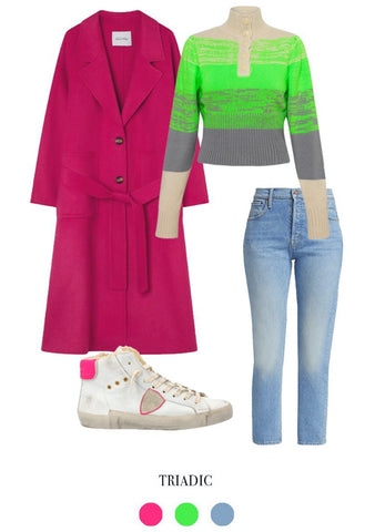
With the warming weather it's time to match your wardrobe to the hues of spring. This season we're using colour theory to aid us in the dressing process. Try complementary tones likes green and purple, red and cyan or yellow and navy for a high contrast, high impact vibe. Or for a little more versatility go with a triadic palette (three colours the are equally spaced on the colour wheel) some example include pink with green and blue or orange with aqua and purple. Here are some of our favourite pieces to get into the rainbow spirit.

An analogous colour palette refers to three colours that are side by side on the colour wheel. As this palette can often get a bit overwhelming it can sometimes be best to choose one colour to dominate and use the other two colours as accents. Here we've put together an analogous look featuring red, orange and yellow.

A triadic palette features three colours that are evenly spaced on the colour wheel. This provides high contrast, but slighting less so than a complementary palette and can therefore be a more versatile. Here we create a triadic palette with pink, green and blue.

Complementary colours are two colours that sit on the opposite sides of the colour wheel. Due to their positions on the colour wheel these hues will be high contrast and high impact. Examples of this include red with cyan, blue with orange and green with purple.
Shop our collection of curated styles to help you get started on your Dopamine Dressing dreams - Shop Colour Code Now


